Business
How To Build An Unforgettable First-Time User Experience
You only get one chance to make a good impression.

You only get one chance to make a good impression.
I speak often on the difference between building an MVP (Minimum Viable Product) and what I like to call an MLP (Minimum Lovable Product).
I don’t believe in building MVPs.
I believe in making incredible product experiences. And that starts with unforgettable first-time experiences for new users.
Contrary to MVPs, where the goal is to get something barely usable out the door and into the market for initial feedback, an MLP takes the opposite approach, treating, among other things, the first-time experience of a new user very seriously.
This is the first time they’ll see your product, the first time they’ll experience who you are and everything you stand for. And if what they experience is bare bones and clunky, that’s how they’re going to remember you.
You have to earn the right to more of your users’ time.
Most startups don’t think about it that way.
Instead, they think solely about the core product features, “the value proposition” and worst of all, what their marketing strategy is going to be. How a new user experiences the first 30 seconds using that product is almost an afterthought.
Imagine if that’s the approach Apple took. Imagine if your brand new iPhone came in a worn cardboard box — instead of the pearl white vacuum chamber that feels like you’re being given a prized jewel. Or imagine if, the moment you turned on your brand new MacBook, it was out of battery. Or it couldn’t locate your local WiFi signal and easily connect to the Internet.
As a new user, you would immediately feel frustrated, upset, let down — instead of excited, joyful, or eager to start playing with the product.
If you want to build a product people love, you have to build a first-time user experience that tells an emotional story.
Let me give you an example.
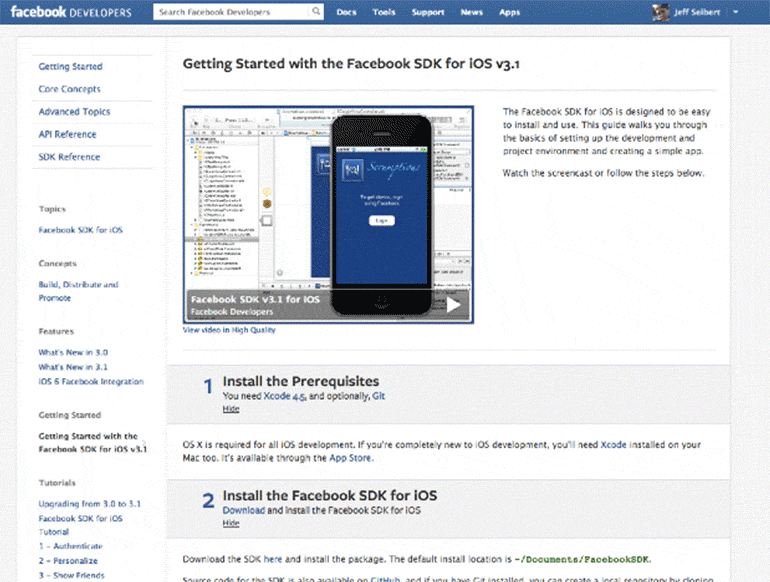
When we were building Crashlytics, we discovered that the first-time experience for developer tools for mobile were abysmal. Facebook was the creme de la creme, and theirs was a long, instructional page with endless links that took 20–30 seconds to scroll down. Others had wikis with 72-steps (“Oh, you use a Mac? Click here…” 26 more steps… “Now go back and resume.”). Or even 10-minute long YouTube videos with a guy speaking in monotone voice: “Now.. drag this… here. Then… click… there.”
What an awful way to make a first impression and to start a relationship with your users!
So, we decided to fix that.
We asked, “How can we make the first time experience fun, delightful, and do something that Facebook, Google, Amazon, and others obviously couldn’t do?”
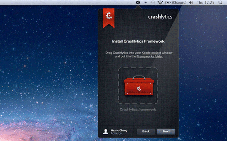
Well, we built a consumer-grade installer app. It even had an icon that *wiggled* so developers could understand it had to be dragged. This may seem like an easy (even obvious) undertaking, but to create an installer that worked on millions of computers, especially developers who loved to tinker and modify and customize their setup was no easy feat.
In fact, we spent the majority of our time building this first-time experience, more so than we did the core Crashlytics SDK code!
But it all paid off. Enormously.
Our first-time experience was like nothing developers had seen before. They Tweeted about it. They told their friends. Eventually, by the time Twitter acquired us, we were already on 300 million devices. Today, we’re on almost 3 billion monthly active devices.
Think this was a one-off? Let me give you another example where our focus on first-time experience helped us dominate another category. This time, it wasn’t a niche category like mobile crash reporting.
Next, we were going to go for the crown jewel — mobile analytics itself.
When we were building Answers in 2014, our mobile analytics product built to work with Crashlytics, we were launching a competing product to Google Analytics, the 800-pound gorilla in the analytics space — along with every other product in mobile analytics. And there were many: Flurry, Localytics, Mixpanel, etc.
This space was incredibly competitive with very high stakes. Flurry was reportedly acquired by Yahoo for about $300 million — and they were number two at the time. And Localytics and Mixpanel had each raised almost $100 million, occupying positions three and four on the top list.
When we were doing our initial research, one of the most glaring things we found was the way every other company handled their onboarding process.
You signed up for an account. You added your code. And then, as a first-time user, you were given a dashboard screen — and because it hadn’t collected any data yet, the dashboard was completely empty. A big empty void. There was nothing to do with zeros across the screen and flat-lined bar graphs.
As we went through the onboarding flow of our competitors, we noticed that, as users, our first-time experience didn’t feel very good.
It was very mechanical: Enter your name. Your email. Insert this code. Now look at this empty dashboard.
We thought, “This was what billions of dollars of value looks like for analytics?”
We didn’t want to do that with any of our products. We wanted our first-time users to feel inspired, and for the experience to be thoughtful, and well-crafted.
So, instead of thinking of our onboarding sequence as another box we needed to check-off in order to build an MVP, we spent a considerable amount of time working on that first touch point with a new user.
We didn’t just want them to use our product. We wanted them to love it.
Here’s what we did:
With software products, there tends to be a bias toward more options. It’s the easiest, laziest way to solve a problem. “Should we show the user a dashboard of this first, or that first? Well, let’s have them choose!”
This is the worst way to design and build products.
With the onboarding flow, it is one of the only opportunities where you can force a linear progression in the decision tree of your product.
We took that opportunity and ran with it.
Our onboarding flow was a product experience in its own right. It had just as much thought put into it as the final product experience.
When a user signed up, rather than giving them a million options, we showed them screens in bite-sized chunks. The human mind largely prefers information in digestible chunks (see how even this blog post is chunked out?). Embracing this for onboarding means a much more pleasant experience for the user.
Each easy-to-understand screen only asked for information that we absolutely needed. This meant we didn’t ask for information that we couldn’t use right away.
This is the golden rule:
Don’t ask for information your product can’t use right away. It means higher friction, adds to frustration, and takes away from the overall experience.
Our onboarding flow also required engagement. This meant we didn’t just dump them to an empty dashboard.
As part of the onboarding and first-time experience, we made absolutely sure their code was installed. We deliberately asked them to fire up their app so that it would hit our servers. Of course, this meant extra engineering for us, since instead of simple account creation, we had to add a significant amount of logic to check the status of their own code, in their own app, and then display prompts, etc.
However, this extra effort was worth it.
Because we took the time to do this, it meant we were sure our code was in their app correctly. And our users got to experience the product first hand, right off the bat.
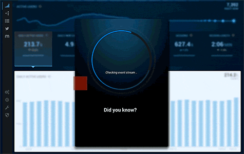
On top of that, instead of throwing them into an empty dashboard, we created a fake dashboard filled with charts, but had it blurred in the background. In the foreground, we presented a small screen that had a spinner on it — and within that modal, we had these animated blocks flying on-screen.
Until it became clear to the user that the blocks assembled… their own app’s logo.
Our users loved that. This was a stark contrast to the form-based onboarding others in the space forced. We saw tweets about our onboarding — how delightful it was, how fun it was, and how personal it felt. This was when we knew we had made something memorable.
Now, you may be wondering why a startup would prioritize spending so much time on the onboarding sequence and not investing that time in the core product instead.
The results speak for themselves.
Crashlytics was ranked #1 in mobile performance, and it had more usage than the platforms sitting at #2 through #6 — combined.
Answers, our mobile analytics product, became the fastest-growing mobile analytics product out there. We beat Flurry and then Google Analytics, and were ranked #1 within 10 months of launch.
At the 1-year marker, Crashlytics was acquired by Twitter.
Then, in 2017, after Answers launched, Crashlytics and Answers were acquired by Google from Twitter.
Obviously, we had to do a lot of other things right to become the leader of the mobile performance and the larger mobile analytics space, but our attention to detail for a new user’s experience is what ignited word of mouth around our products.
We didn’t need marketing. We didn’t need to overspend in those departments other startups allocate so many (too many!) resources to.
When you make something lovable, the product speaks for itself.
So, how do you actually create an unforgettable first-time user experience?
It comes down to the perception of time.
A new user is extremely impatient. They don’t trust you yet. They don’t know what to expect, and they’re trying to decide (as quickly as possible) if you’re going to make their life easier, faster, and more efficient, or slower, more annoying, and boring.
I often draw parallels between product design and video games because, of all industries, games are in the business of time. The more a game can make you feel like an hour has just flown by, the more likely you are to spend another hour, and another hour playing in their world.
And when it comes to first-time user experiences, nobody does it better than gaming companies. From the moment you start a new game, you’re either immersed in it, or you’re gone.
Overwatch, the popular multiplayer game by Blizzard Entertainment, did something interesting with their waiting screen that I find to be a perfect example of creating a lovable product that respects a user’s time.Traditionally, when you’re playing a multiplayer game online, you have to wait for other players to join before the match can start. If it’s 6 vs 6, you need all 12 players — and for most games, players are left sitting in a waiting screen: waiting for all users, finding server, etc.
What Overwatch did, which was clever, was instead of forcing players to wait, they would throw them all into a mini-game. It had no objective, no rules. It was just a leisurely way of spending time interacting with each other in the game world. And instead of opposing players running around and attacking each other, like a normal game, they would do things they wouldn’t normally do — like wave at each other, cooperate, etc. It was a new way to experience the same game, but was the equivalent of a waiting screen.
When a startup company is visualizing their product, they tend to forget the moments a user has to wait.
They draw mockups of the different screens of their product, filling them with an array of charts and numbers and vibrant data sets, only to forget (when their product goes live) that a new user is going to be starting with… nothing. No data. No long term usage. Zilch.
But what about the first time a user sees that dashboard? What about the first time a user looks at their “friend list” or message box?
It’s going to be empty.
Which means it’s your job to examine that specific moment in time and ask, “What can we do to make a user feel included here? How can we make them feel like they’re not waiting for something to happen — but that it’s already happening?”
A lot of startups only approach the product they’re building from an engineering perspective, not a people-centric view.
And people are very aware of time — how they spend it, how long things take, and the relationship between the amount of time they’ve invested and what they’ve gotten in return. The perception of time is very subjective.
Which means, if you’re able to have the user’s mind focus on something else, time will move faster. And boring things like waiting — for a dashboard to populate, for example — will feel much shorter, which makes a user feel engaged and more likely to stick around.
Here are some quick examples of how to make a first-time user feel as though time is moving faster than it actually is.
In general, we would classify these as Progress Indicators.
- Tips for the product: When a new user first enters the product, it can be extremely helpful to give them indicators on where things are and how it works. But this can also be a tactic for continuously keeping them engaged as they continue to use the product over time (as long as it’s done strategically and doesn’t become an annoyance).
- “Did You Know?”: Loading screens are an excellent place to put quick, interesting facts relevant to the product or its use case scenarios.
- Quotes: Slack does this. When you’re waiting for a Slack channel to load, you’re presented with a quirky quote. It’s something to take your mind off the fact that you’re waiting.
- Animations: Loading animations, especially, can help a user feel as though they’re witnessing something creative or unique unfold right in front of them — instead of feeling like they’re waiting, waiting, waiting for something to happen.
- Follow-up sequences: You can’t forget the time that takes place when a user is away from your product. For example, what we would do is send our users beautifully designed emails with impromptu updates that said things like, “TL;DR — your app was 98.% crash free this week.” This positive reinforcement made them feel great in the moment, and gave them even more reason to come back and continue using our product.
Now, what if you’ve built a product that multiple users from the same team log into? How do you ensure they all have that same unforgettable first-time user experience?
This is something we ran into with Crashlytics.
A lot of people have asked how we were able to be so pervasive in the analytics community, and get so much usage, so quickly.
The truth is, we spent a lot of time thinking about how our product was going to fit into the natural work flow of everyday users. So many startups try to build products that, while might be great in theory, work against the natural daily rhythms, their natural workflow, of the very customers they’re looking to attract.
Case in point: a lot of companies create products where a user might sign up for an account, use the dashboard, and then share their login and password with 10 other team members (in our case, engineers).
The problem with that approach is that the product is only giving one of those users the full first-time user experience.
Which means those email updates or notifications you’re sending as positive reinforcement are only being seen by the person whose email is linked to the account.
That’s not a very people-centric experience. That’s just a product doing what it needs to do to function.
With Crashlytics, we asked ourselves, “How can we have every single mobile developer out there to have that unforgettable first-time user experience — regardless of whether they’re on the same team as another developer using our product?”
Why did we ask ourselves this? Because if one person has that lovable first-time experience, they’re going to tell someone else about it.
Which means if 10 people have that lovable first-time experience, they’re going to tell 10 other people about it.
This was a human-centric growth tactic. And it spread like wildfire.
How we engineered this was we looked at the natural workflow of a developer and realized that part of their daily routine was to check in their code — either every few hours, once per day, etc.
So, we created a user experience where as soon as user #2 of a company downloaded or synced up to the latest code tied to that company’s app, a pop-up would appear that had the profile photo of the first developer, and a message that said, “Hey, John needs to verify you’re on his team. Please type in your email address.”
They would type in their email, and now they’re another user under Crashlytics — which means they’re also receiving those same notifications and emails instilling positive reinforcement.
That small level of detail was the difference between each app company having a Crashlytics account, and each developer within a company having their own Crashlytics account.
Here’s my final piece of advice for anyone who wants to build an unforgettable first-time user experience:
Most entrepreneurs envision their product in its best light. They imagine millions of people using it, capturing lots of data, showing tons of activity.
This is what I call a Day 40 vision. They create mocks of this vision. It looks great in an investor deck, but has little value beyond that. Few startups actually focus on Day 0, then Day 1, etc.
Most users drop off well before Day 40. They need to continually see, and feel, the proofs of value. Otherwise, they’re going to enter an empty app, a stale product, and find little reason to continue using it.
This is why I emphasize so heavily the importance of creating a first-time experience that delivers real value, and shows a user what they can expect moving forward, day after day.
Unfortunately, most startups don’t focus on that first user experience — and they suffer for it. Which is why so few users make it to Day 40, and so few companies last through their initial round of capital.
The one question I ask almost every company I’m an investor, advisor, or mentor of (and I’m in over 50+ startups at the moment) is what their onboarding process looks like.
“How do you interact with your users on the second day?”
You only get one chance to make a good first impression. The First Time Experience is as key to your product’s success as any of the other features in your product, if not even more important — since it is the very first feature they will interact with.
Remember, you have to earn the right to more of your users’ time.